Pink, the color of sweet treats, romantic sunsets, and girlie getaways, has long been a staple in the world of interior design. But while some might view it as a color better suited to a nursery or a teenager’s bedroom, the truth is that pink can be a chic and sophisticated addition to any room. From soft blush tones to bold fuchsia hues, pink has the power to add whimsy, playfulness, and femininity to even the most masculine of spaces.
In this article, we’ll explore the many ways to incorporate pink into your decor, from accent walls and statement pieces to textiles and accessories, and discover how this often-maligned color can be used to create a look that’s anything but juvenile.
Understanding the Psychology of Pink in Interior Design
Understanding the psychology of pink in interior design is key to harnessing its unique qualities and effects within a space. Often associated with feelings of warmth, romance, and nurturing, pink exudes an inviting aura that can make a room feel more welcoming. This color is frequently linked to calmness and tranquility, making it an ideal choice for spaces designed for relaxation, such as bedrooms and cozy reading nooks. The softer shades of pink tend to evoke a sense of innocence and youthfulness, while bolder hues can add a vibrant and playful energy.

In terms of emotional impact, pink has been shown to reduce feelings of aggression and negativity, promoting a soothing environment that can enhance well-being. When decorating with pink, it is essential to consider the balance between the color’s psychological effects and the overall ambiance of the space. Combining pink with complementary colors and textures can amplify its positive attributes while preventing it from overwhelming the design.
Ultimately, incorporating pink thoughtfully can lead to a harmonious and emotionally supportive environment, transforming any interior into a haven of comfort and creativity.
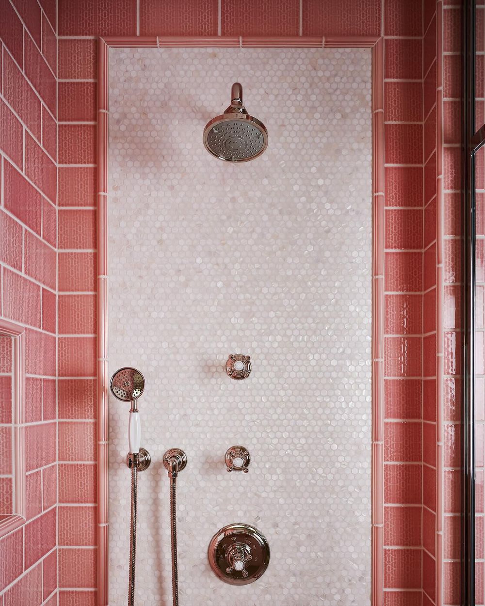
Choosing the Right Shade of Pink for Your Space
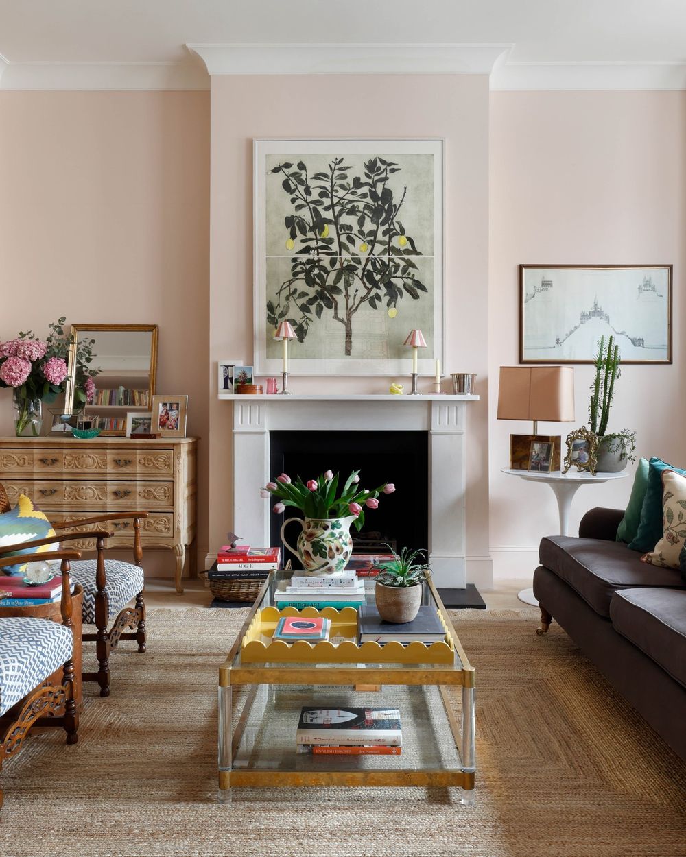
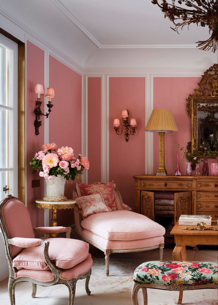
Choosing the right shade of pink for your space is a crucial step in achieving a harmonious and inviting environment. Pink is a versatile color that can evoke a range of emotions and atmospheres, from playful and whimsical to calm and sophisticated. The first consideration should be the mood you want to create. Soft pastels, such as blush or powder pink, are perfect for creating a tranquil and romantic atmosphere, making them ideal for bedrooms or serene living spaces. Alternatively, bolder shades like fuchsia or hot pink can inject a sense of vibrancy and energy, making them suitable for lively areas like creative studios or lively lounges.
Lighting also plays a significant role in how pink appears in your interiors. Natural light can enhance the freshness of lighter shades, while artificial lighting may warm up deeper tones, making them feel cozier. When selecting a pink, consider the other colors in your palette; pink pairs beautifully with neutrals like white, beige, and gray, as well as vibrant colors like emerald green or navy blue, offering versatility in design. It’s also wise to test your chosen shade in your space before committing, as the surrounding decor and furniture can significantly affect how the color is perceived.
Incorporating Pink Accents: Furniture and Accessories
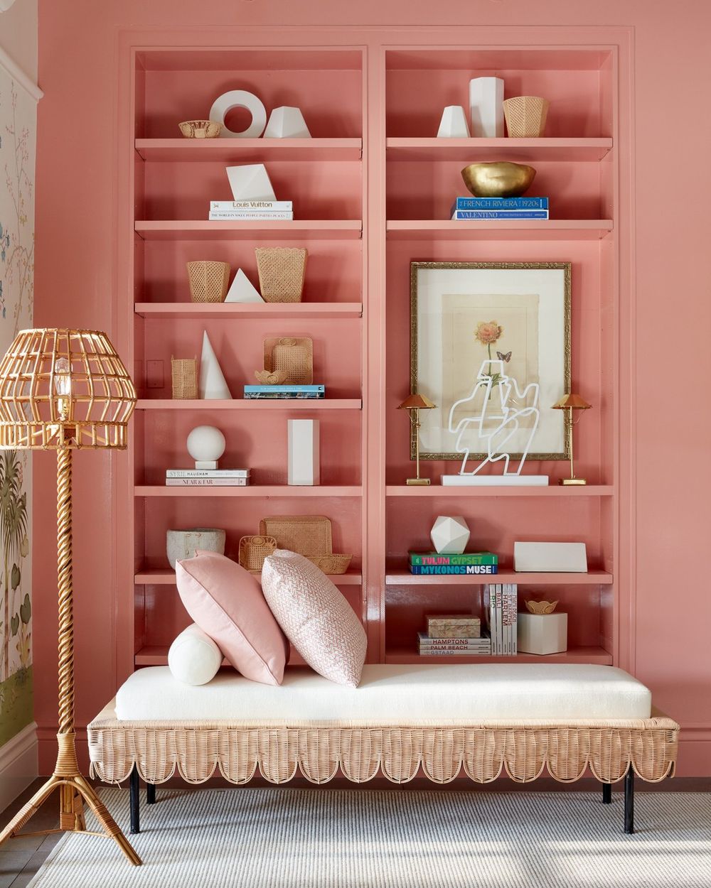
Incorporating pink accents through furniture and accessories is an effective way to introduce this vibrant color into your space while maintaining a cohesive aesthetic. When selecting furniture pieces, consider using soft pink upholstery for sofas or chairs, which adds a subtle yet impactful touch to the room. A blush pink armchair can serve as a stunning focal point, pairing beautifully with neutral or darker shades in the room.


Additionally, incorporating a piece like a pink ottoman or a coffee table with pink accents can enhance the color scheme without overwhelming the space. To elevate the overall design, accessorize with pink decorative pillows, throws, or even a vibrant pink rug that can tie the room together. Consider adding art pieces with pink tones, such as canvas prints or framed photographs, to create visual interest on your walls.
Small accessories like vases, candles, and picture frames in varying shades of pink can be layered throughout the room, providing texture and depth. The versatility of pink allows it to harmonize with a variety of colors, so don’t hesitate to combine it with greens, blues, or golds for a balanced look.
Combining Pink with Other Colors: Color Schemes and Palettes
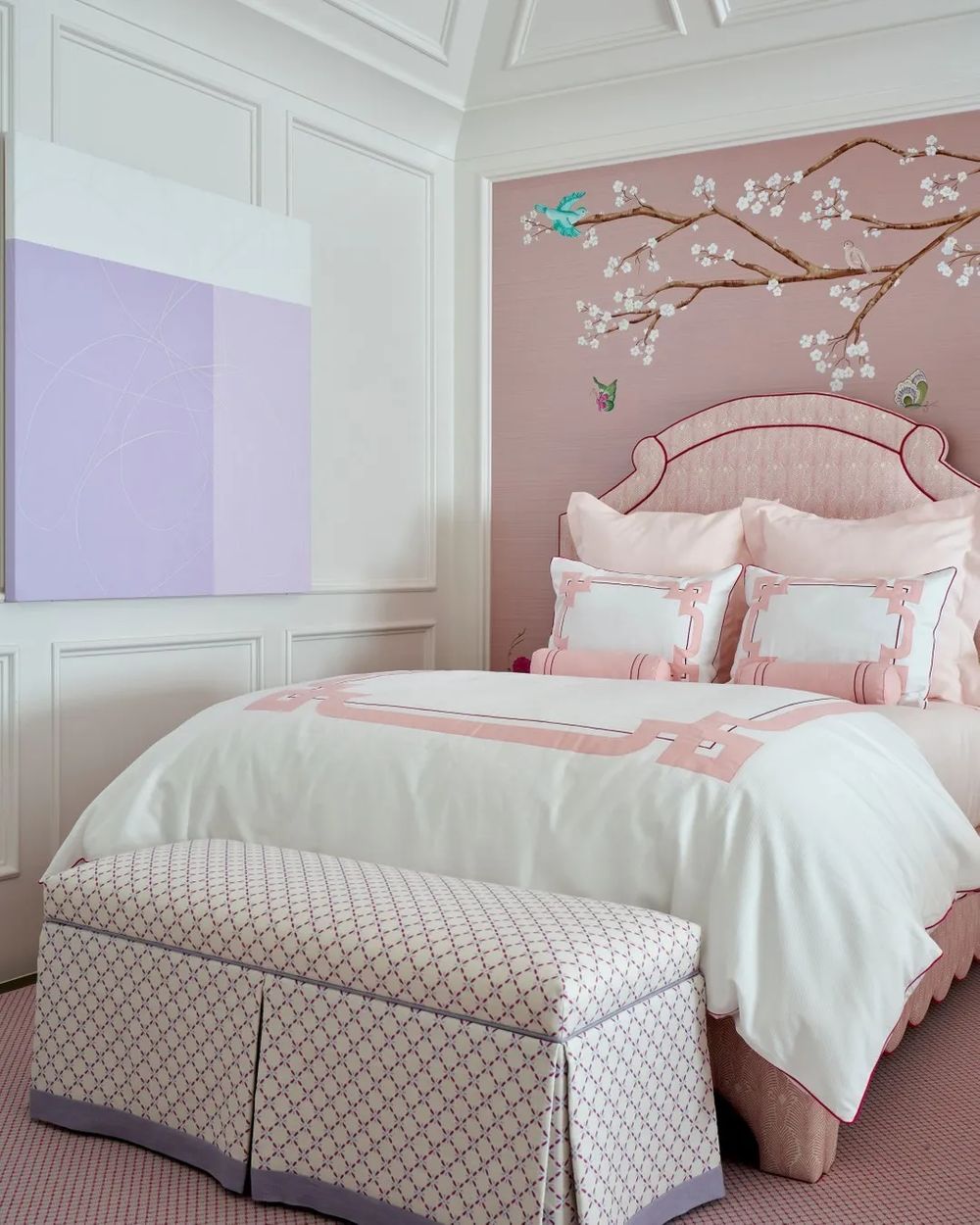
Combining pink with other colors can create a wide range of atmospheres and styles in interior design, making it a versatile choice for various settings. When paired with neutrals such as white, beige, or gray, pink takes on a sophisticated edge, perfect for creating a serene and calming environment. This combination is ideal for bedrooms or living areas where a sense of tranquility is desired. For a bolder approach, consider pairing pink with rich jewel tones like emerald green, deep blue, or amethyst. These contrasts not only elevate the pink but also add depth and vibrancy to the space, making it feel luxurious and dynamic.

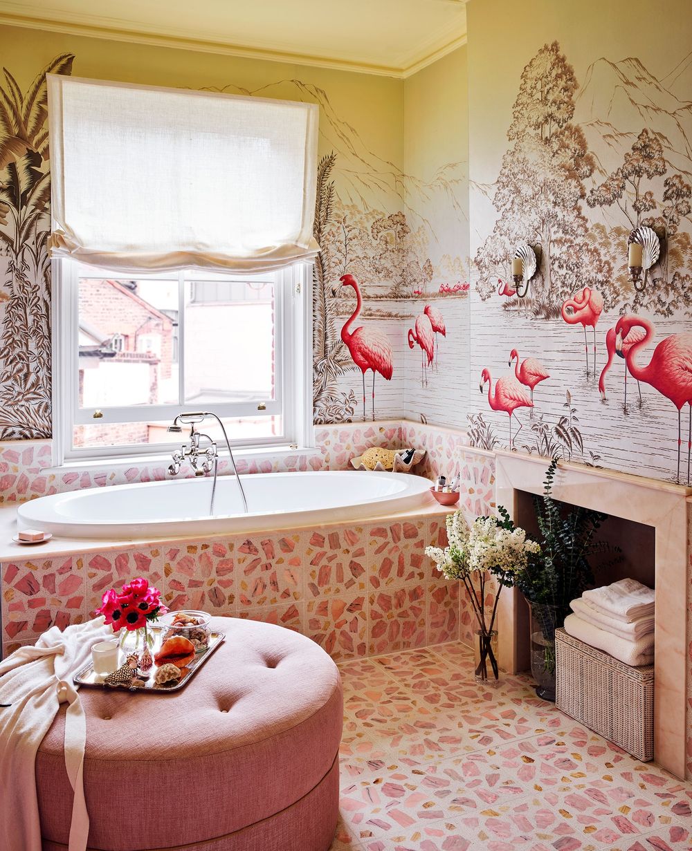
If you’re aiming for a playful and energetic vibe, combining pink with bright colors like yellow, orange, or turquoise can create a cheerful and lively atmosphere, perfect for children’s rooms or playful living areas. Additionally, pink can harmonize beautifully with earth tones such as terracotta or olive green, creating a warm and inviting space that feels grounded and natural.
By carefully selecting color combinations, you can use pink to evoke a variety of emotions and set the overall tone of your interior design. Whether you’re going for subtle elegance or bold exuberance, the way pink interacts with other colors can significantly influence the aesthetics and ambiance of your home.
Pink in Different Design Styles: Modern, Vintage, and Eclectic
When it comes to decorating with pink, different design styles can transform the way this versatile color is perceived and utilized within a space. In modern design, pink often takes on a sophisticated and fresh interpretation, frequently paired with minimalist aesthetics. Think blush or soft rose hues that create an airy atmosphere, complemented by sleek furniture and geometric shapes. This restrained palette can be used in accent walls, upholstery, or decorative accents, allowing pink to evoke a sense of calm and tranquility while maintaining a contemporary edge.
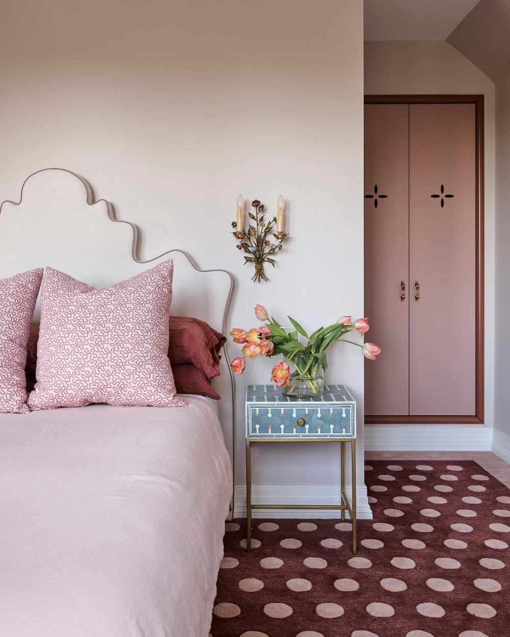
On the other hand, vintage design embraces pink in a more nostalgic and romantic way. Soft pastel shades or rich, deeper pinks can be found in floral patterns or damask prints, often seen in antique furniture pieces or curated collections of vintage decor. This style allows for layering textures and incorporating retro accessories such as velvet cushions or lace curtains, which enhance the warmth and charm associated with vintage aesthetics. Pink becomes a storyteller, evoking memories and creating a cozy, inviting ambiance that harkens back to a bygone era.
Eclectic design, meanwhile, celebrates the vibrant and bold aspects of pink, encouraging playful experimentation. In this style, pink can clash or harmonize with an array of colors, patterns, and materials, creating a visually dynamic space. You might see bright fuchsia contrasted with rich jewel tones or unexpected textures like metals and woods. Eclectic interiors thrive on a mix-and-match philosophy, allowing for unique finds from various eras and cultures to coexist beautifully. In this way, pink serves not just as a color but as a statement, unifying diverse elements into a cohesive and lively environment that truly reflects personal style.
Textiles and Patterns: Using Pink in Fabrics and Wallpapers
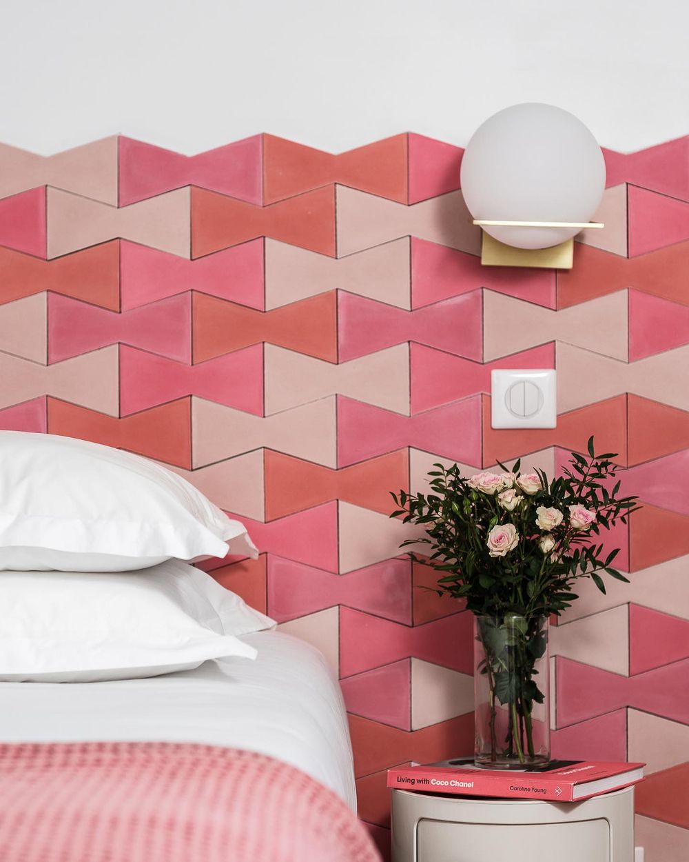
When it comes to incorporating pink into interior design, textiles and patterns offer a versatile avenue for expression and style. Pink fabrics and wallpapers can infuse a space with warmth, playfulness, and sophistication, depending on the shade and pattern chosen. Soft pastel pinks work wonders in creating a serene atmosphere, making them ideal for bedrooms and nurseries, while bolder fuchsias or magentas can electrify a living room or dining area. In textiles, the use of pink in upholstered furniture, curtains, and cushions can introduce a refreshing focal point that draws the eye without overwhelming the senses.

Moreover, patterns that incorporate pink, such as florals, geometric shapes, or even abstract designs, can create visual interest and depth, enhancing the overall decor. Mixing pink with complementary colors like grey, navy, or gold can help balance its vibrancy, allowing it to shine while harmonizing with the surrounding elements. Wallpaper featuring pink motifs can transform an ordinary room into a stunning statement space, serving as an artistic backdrop that adds character and charm.
Tips for Balancing Pink in Small vs. Large Spaces
When it comes to balancing pink in small versus large spaces, understanding scale and proportion is crucial. In small spaces, such as a cozy bedroom or a compact living area, it’s best to use pink as an accent color rather than the main event. Soft pastel shades of pink can create a sense of airiness and openness, making the room feel larger. Consider incorporating pink through accessories like throw pillows, artwork, or a rug, which allows for the integration of this vibrant hue without overwhelming the space. Additionally, mirrors and light-colored furniture can help diffuse the pink tones, enhancing the overall ambiance.
In contrast, larger spaces provide more freedom to use pink as a primary color without the risk of overpowering the room. For expansive living rooms or open interiors, bolder shades of pink can make a striking statement when used for feature walls or large furnishings like sofas and curtains. Layering varying shades of pink can also add depth and interest to the room.
When decorating a large space, it’s essential to balance the pink with complementary colors and textures, such as whites, grays, or earth tones, to maintain a cohesive look. Strategically placing pink elements throughout the space can tie the design together, ensuring that the color feels intentional and harmonized rather than scattered.
Ultimately, whether in a small or large space, the key to successfully balancing pink lies in thoughtful selection and placement, creating a harmonious environment that feels both inviting and stylish.