Chartreuse is a vibrant, yellowish-green color with a long history in interior design.
The color chartreuse gets its name from Green Chartreuse, a French liqueur that is known for its distinctive green color. The liqueur, made by the Carthusian monks, has been faithfully produced since 1737. The vibrant green color of the liqueur inspired the name of the color chartreuse, which is a vivid, yellow-green hue.
Chartreuse Color in Interior Design
Historically, chartreuse was a popular color for upholstery, draperies, and wall coverings in grand European chateaus and palaces of the 17th and 18th centuries. It was seen as a luxurious, regal color.
Chartreuse experienced a resurgence in popularity during the Victorian period, often used for wallpapers, furnishings, and accent pieces to create a lively, energetic look.
In the Art Deco era of the 1920s, chartreuse was incorporated into sleek, geometric interior designs, pairing well with black, silver, and metallic accents.
Chartreuse was embraced by mid-century modern designers in the 50s, who used it to add vibrancy and a sense of nature to minimalist, open-concept interiors.
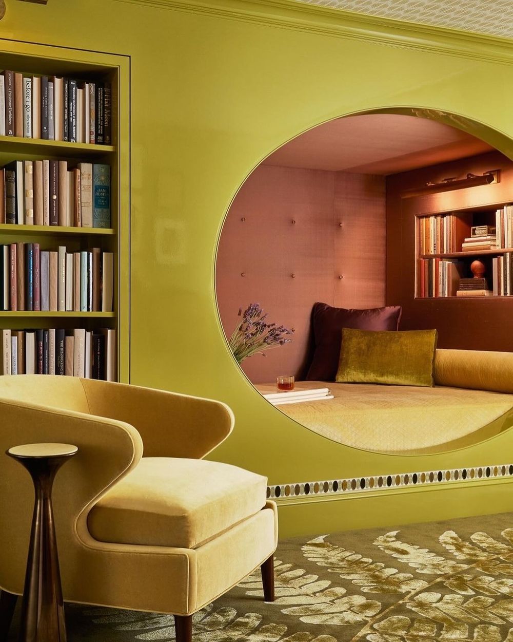
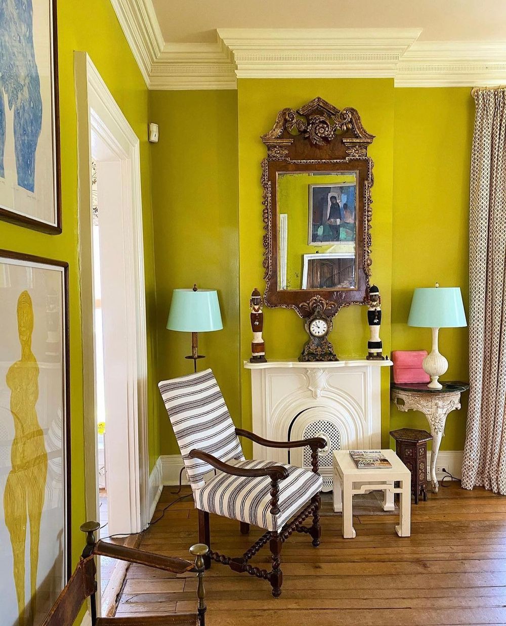
Today, chartreuse remains a less popular color choice, but it is sometimes used in maximalist interiors and traditional homes since it stands out so much.
Chartreuse Color Schemes
Here are some ideas for using chartreuse color schemes in modern home design:
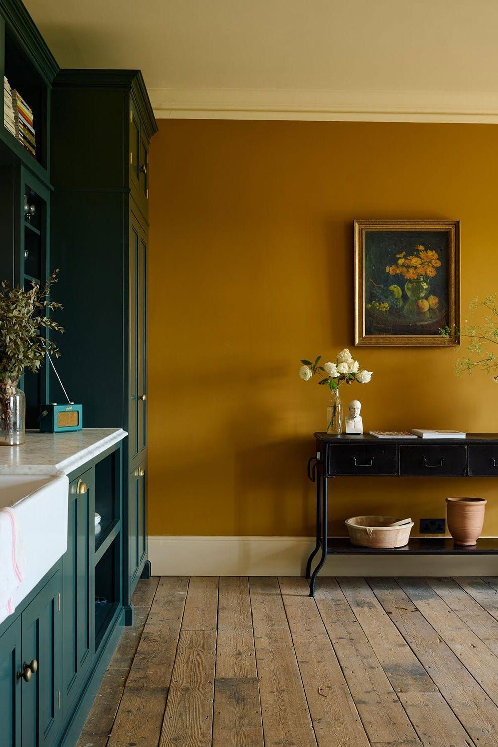
Accent Walls: Painting an accent wall in a rich, bold chartreuse can instantly add energy to a room. This works well in living rooms, home offices, or bedrooms.
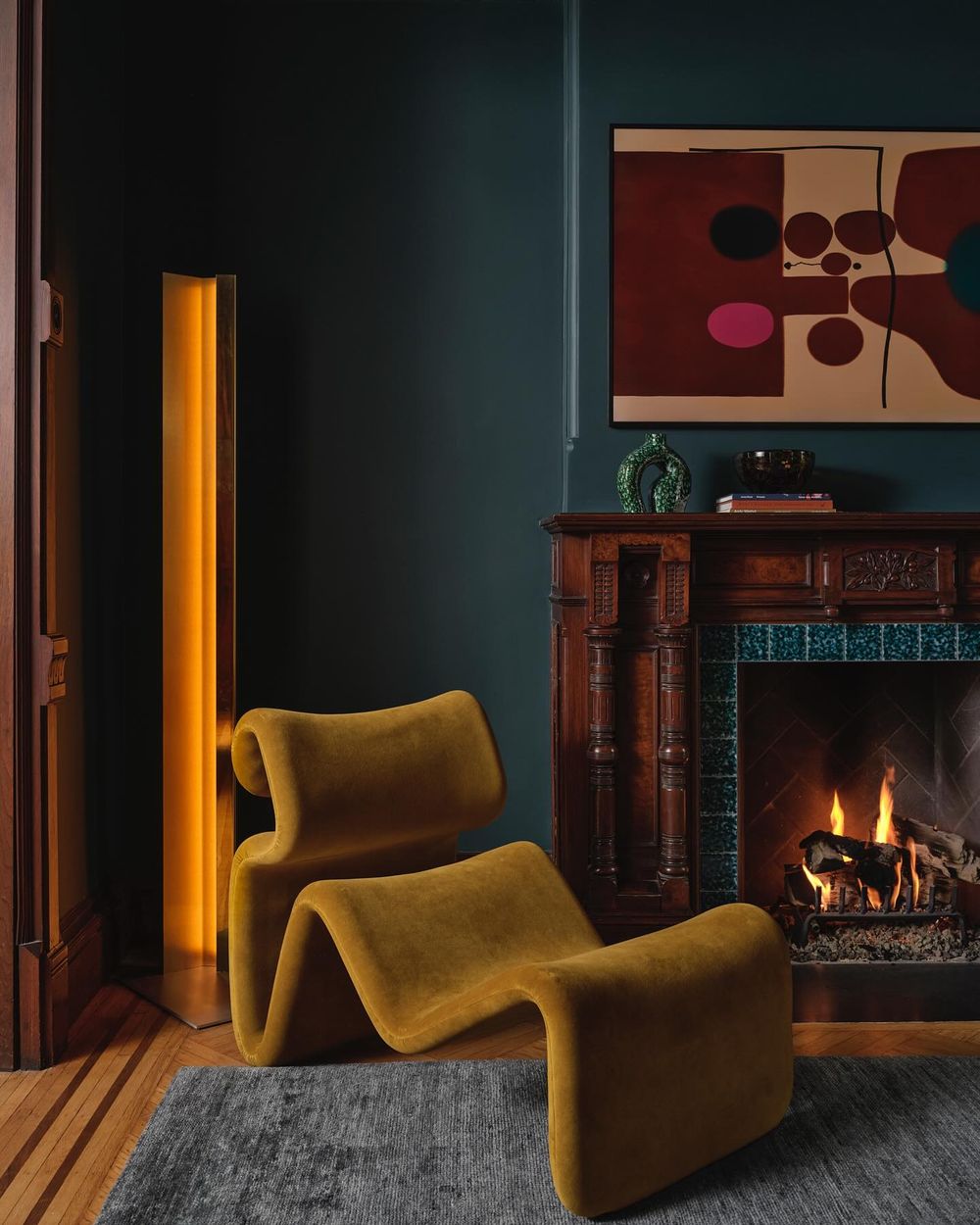
Furniture Upholstery: Chartreuse makes a striking statement when used for upholstery on sofas, chairs, or ottomans.
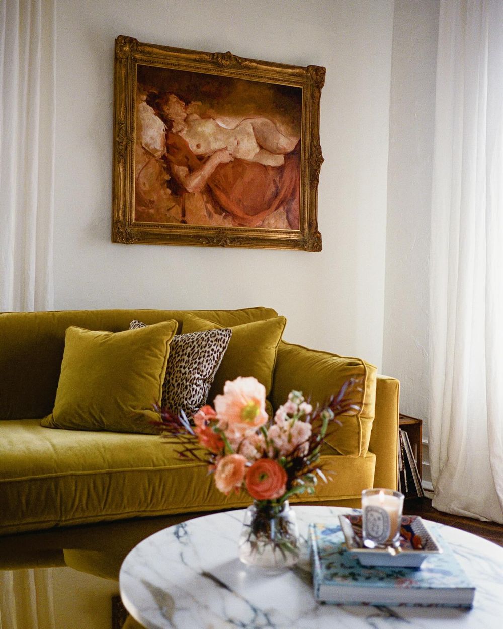
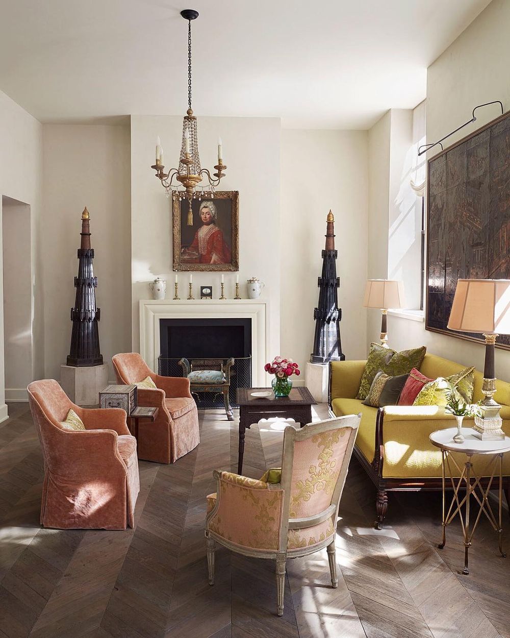
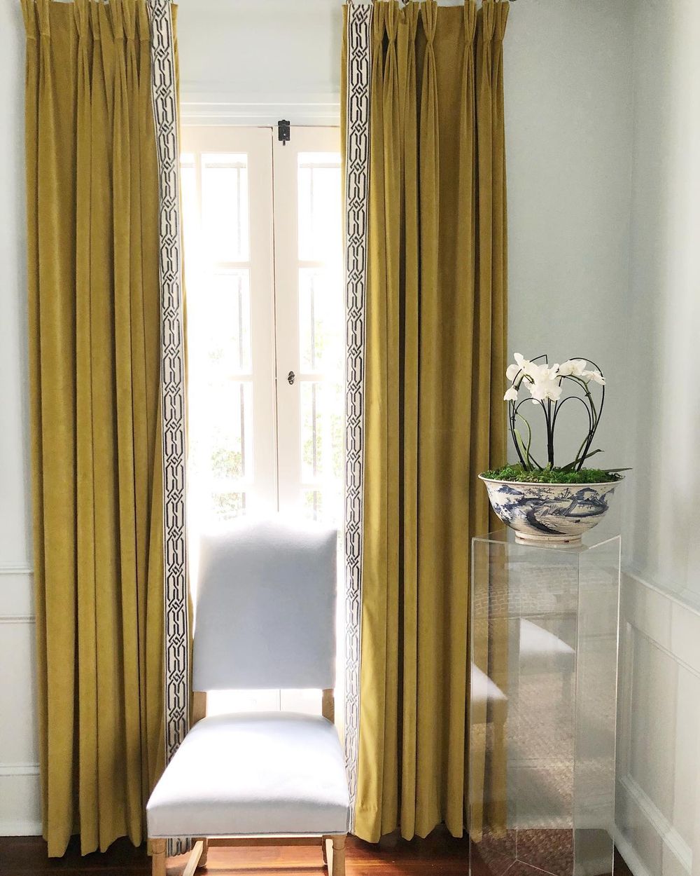
Textiles: It also works beautifully for curtains, throw pillows, and area rugs.
Kitchen Cabinetry: For a modern, high-contrast look, consider painting kitchen cabinets in a bright chartreuse. This pairs nicely with white countertops and backsplashes.
Bathroom Vanities: Chartreuse can also liven up a bathroom, such as on a vanity cabinet or built-in shelving.
Metallic Accents: Combining chartreuse with brass, gold, or bronze metallic accents creates a sophisticated, luxurious feel. Try chartreuse throw pillows with metallic lamps or vases.
Natural Elements: Chartreuse coordinates beautifully with natural wood tones, plants, and greenery to create a fresh, organic aesthetic.
Color Blocking: Use chartreuse as part of a modern color-blocked design, pairing it with neutrals like white, gray, or black for a dynamic, graphic look.
The key is to use chartreuse as an accent color, balancing its vibrancy with more neutral base tones. This allows the chartreuse to pop and energize the space.
Chartreuse has long been valued for its ability to energize and enliven interior spaces, making it a versatile and enduring color choice throughout design history.