Decorating with coral brings a refreshing and lively touch to any room, infusing it with warmth and energy. This versatile color, which sits beautifully between orange and pink, can create both subtle elegance and bold statements in your home decor. From accent walls to accessories, coral is a perfect choice for adding a pop of color to your living space.
What rooms does coral work best in interior design?
Coral works best in bedrooms, living rooms, powder rooms/bathrooms, kitchens/dining areas, and entryways, thanks to its warm pink-orange tones that feel energetic yet inviting, flattering to skin, and mood-lifting.
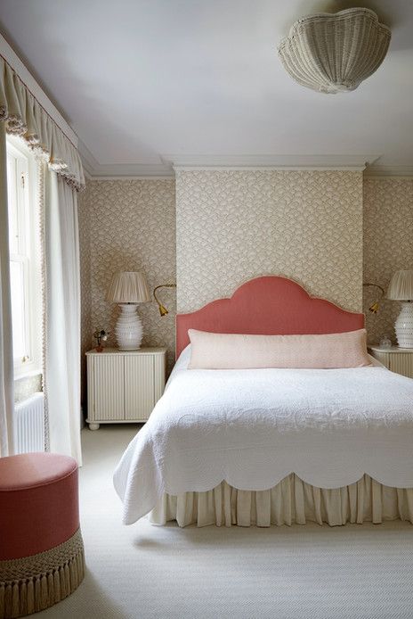
Bedrooms
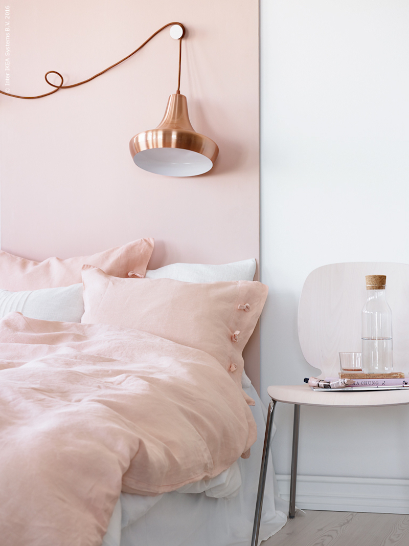
Soft, pink-leaning, or muted peachy corals create a cozy, cocooning retreat without feeling heavy. They enhance natural light and pair well with navy, teal/pale blue, cream, warm whites, or neutrals. Use full walls with lighter shades in brighter rooms, or an accent wall (e.g., behind the headboard) with deeper tones. Designers often treat softer coral as a “warm neutral” layered with linens, wood, and texture.
Living Rooms
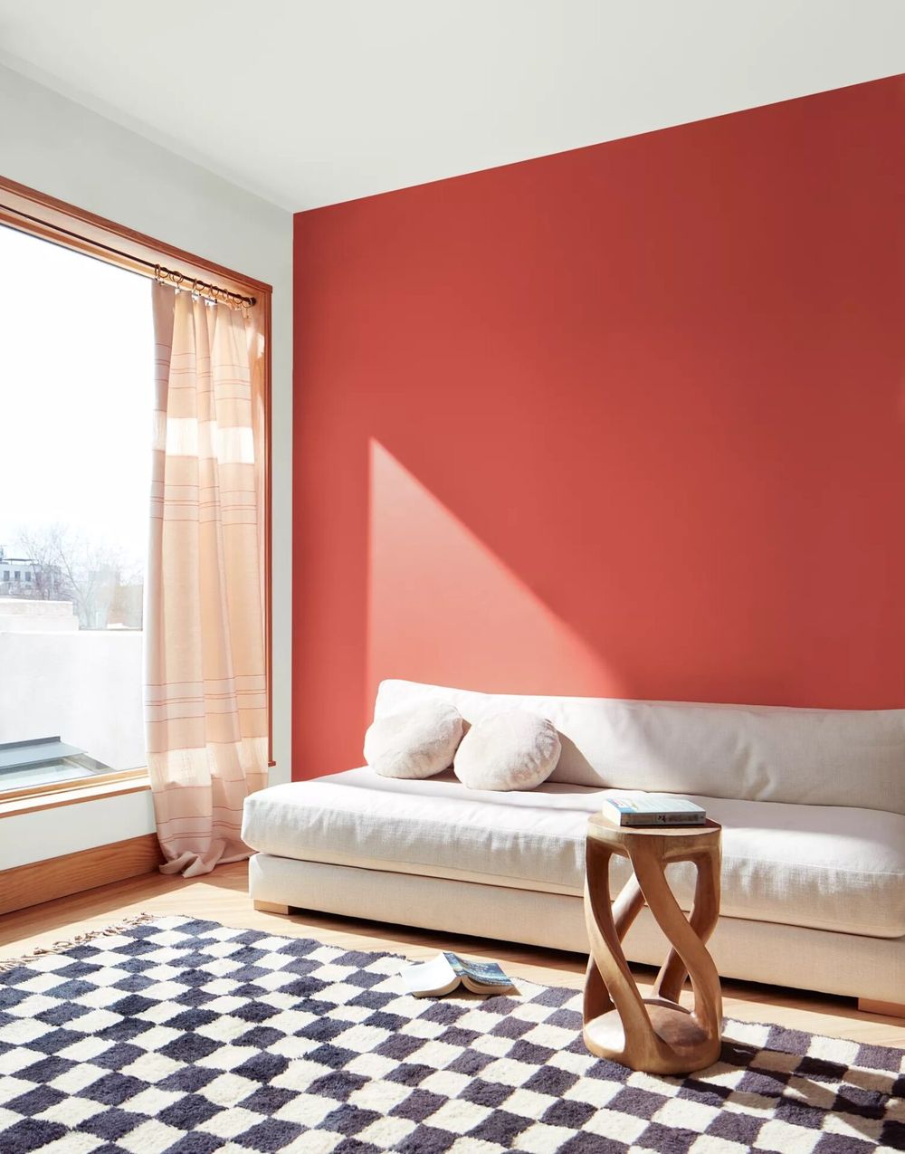
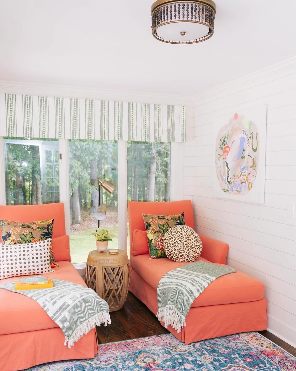
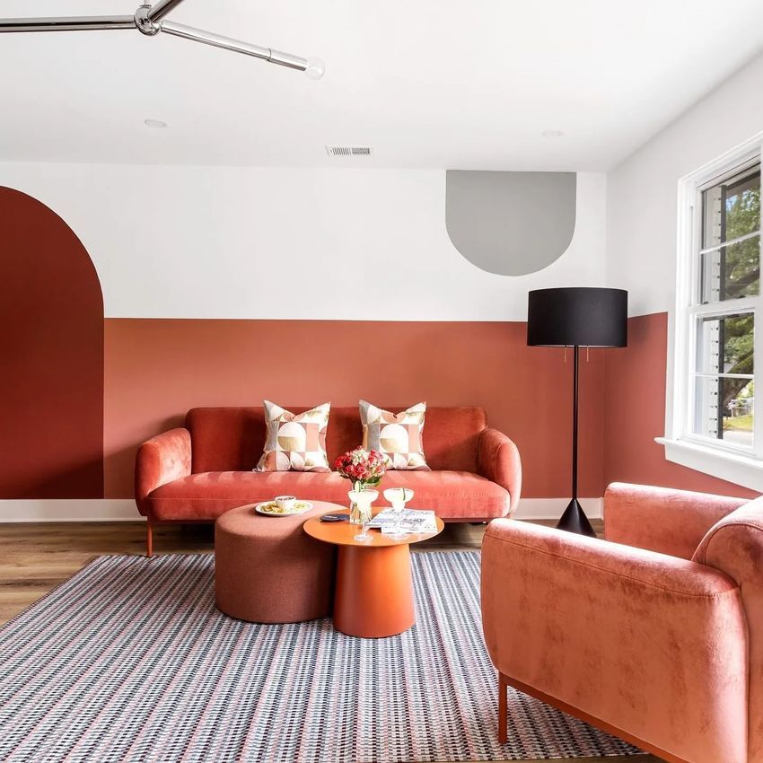
Coral adds sociable warmth and energy. It suits accent walls, sofas, rugs, pillows, or furniture against neutrals, blues (navy, teal), or warm woods. Lighter or mid-tones keep spaces open; deeper ones work as focal points in larger, well-lit rooms.
Powder Rooms and Bathrooms
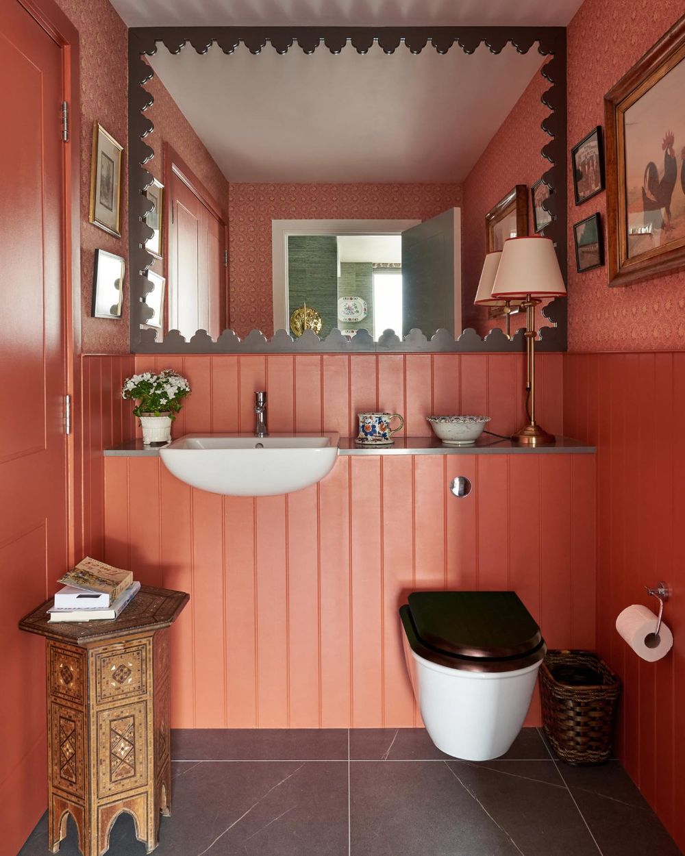
These are standout spots—especially small or windowless powder rooms. Saturated or mid-tone coral turns a utilitarian space into a memorable, flattering one (it makes people look good in the mirror). Use on walls, a vanity, tiles, or accents; pair with teal, brass, or warm stone.
Kitchens and Dining Rooms
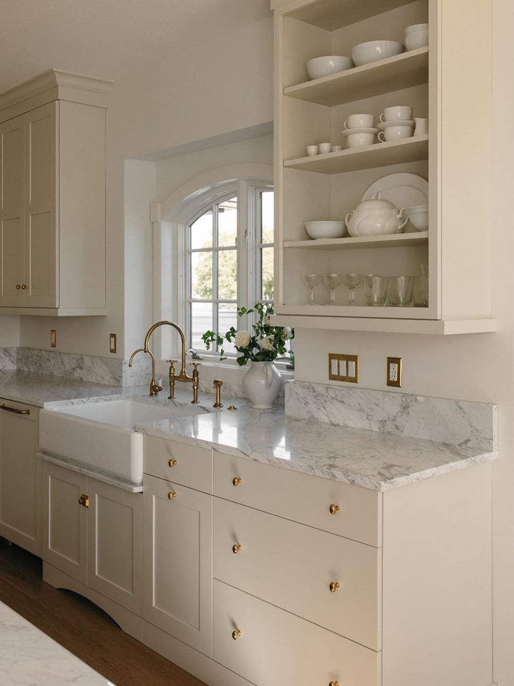
Warm coral tones support appetite and create a lively, festive feel. Prefer orange-leaning shades on islands, lower cabinets, pantry doors, backsplashes, or one accent wall rather than all four walls. Pair with white, oak, brass, or sage greens. Dining rooms handle fuller applications well for a candlelit vibe.
Entryways and Other Spaces
An accent wall or painted door/trim in an entryway sets a welcoming tone. Lighter peachy corals suit nurseries or sunrooms. Unexpected rooms like laundry/utility spaces also benefit—coral adds personality and joy to functional areas.
What color pairs well with coral?
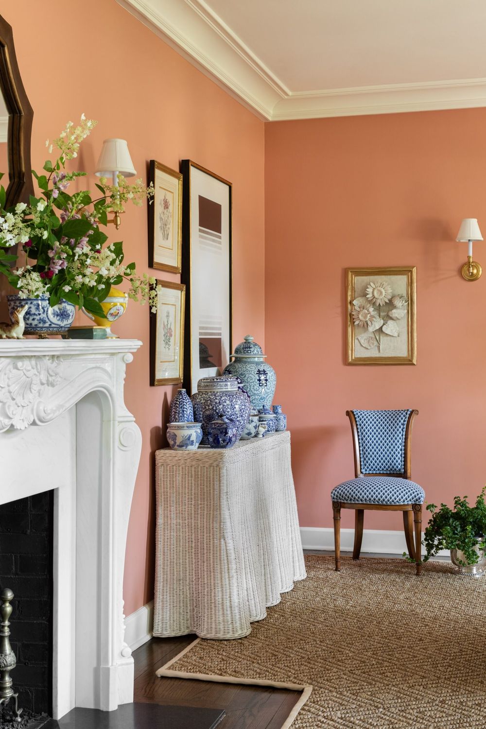
Coral pairs especially well with teal, navy, sage green, warm whites/creams, and gold/brass. These combinations consistently create balanced, stylish interiors.
Top Color Pairings for Coral
| Color | Why It Works | Best Uses | Vibe Created |
|---|---|---|---|
| Teal | Complementary contrast that makes coral pop | Walls, sofas, tiles, bedding | Soothing, seaside, vibrant |
| Navy / Deep Blue | Cool depth against warm coral | Walls, rugs, curtains, furniture | Sophisticated, nautical, preppy |
| Sage Green | Soft cool contrast that calms the energy | Textiles, plants, walls, accents | Natural, restful, balanced |
| Warm White / Cream | Shared warmth; keeps coral fresh without muddying it | Trim, ceilings, large surfaces, bedding | Clean, airy, cohesive |
| Gold / Brass | Repeats coral’s warm base | Hardware, lamps, frames, accents | Luxurious, elevated |
Other Strong Options
- Soft gray, greige, or charcoal — Grounds coral for a modern, polished look. Charcoal creates dramatic contrast; softer grays keep it subtle.
- Peach or blush pink — Analogous (same family) for soft, layered, low-contrast schemes ideal in bedrooms.
- Mint or seafoam — Fresh, playful coastal feel.
- Deep red or burgundy — Analogous warmth for romantic, cozy spaces (especially bedrooms).
- Light blue, turquoise, or aqua — Softer blue alternatives that enhance a tropical or coastal mood.
- Warm woods (oak, walnut, rattan) — Natural textures that complement coral’s warmth without competing.
Quick Tips
- Warm whites and creams work far better than cool pure whites, which can make coral look slightly dirty or harsh.
- For high contrast and energy, go with teal or navy. For calm and cohesion, stick closer to neutrals, sage, or peachy tones.
- Follow a 60-30-10 rule: dominant neutral (e.g., cream or soft gray), secondary color (navy or sage), and coral as the accent (or reverse if you want a bolder coral-focused room).
- Always test samples in your actual lighting—coral shifts with natural light and warm bulbs (around 2700K enhance its glow).
These pairings work across the rooms where coral shines most (bedrooms, living rooms, powder rooms, kitchens, and entries). Teal + coral or navy + coral are the most reliable “wow” combinations.