Cream kitchens blend sophistication with warmth, offering a timeless look that suits various design styles. Their versatile palette allows for creative combinations with other colors and materials, making them a popular choice for many homeowners. From cozy traditional spaces to sleek modern designs, cream kitchens create an inviting atmosphere that’s perfect for gathering and entertainment.

Paint Colors
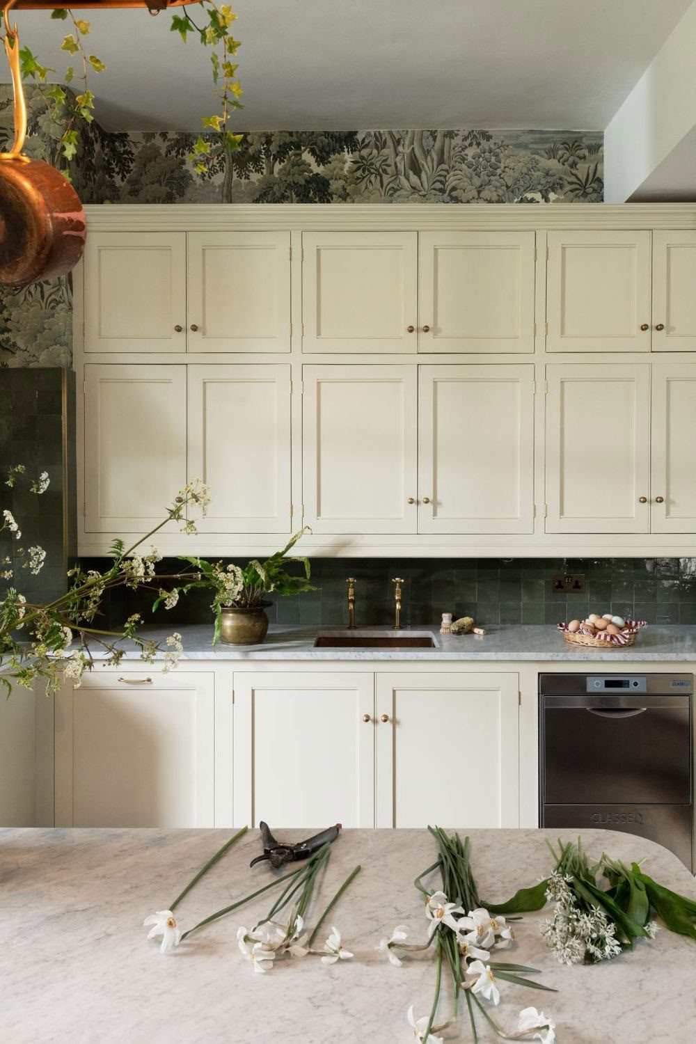
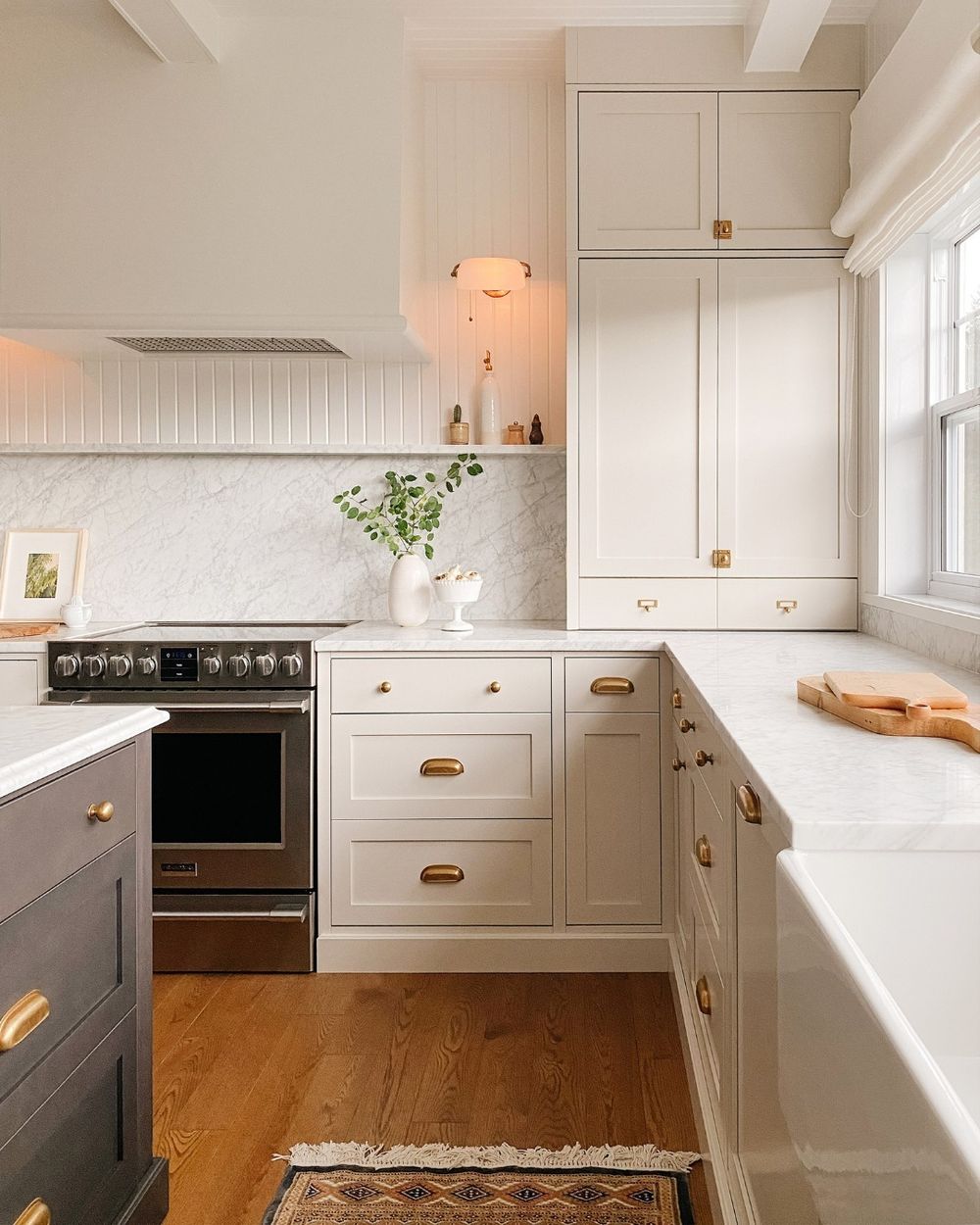
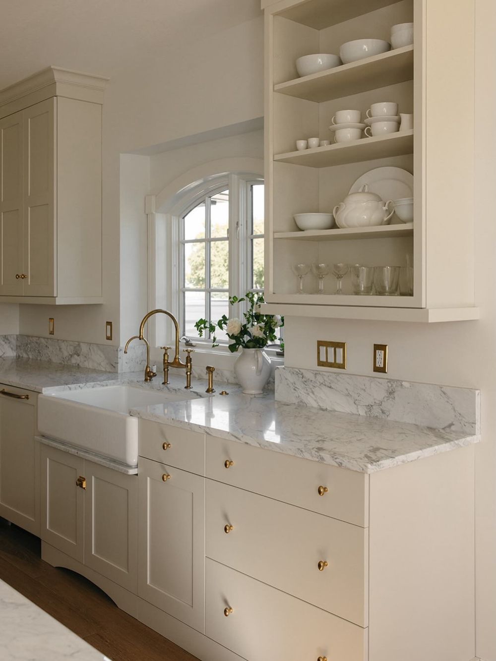
Soft warm neutrals, muted greens, soft blues/grays, and deeper accents like navy or taupe are among the most popular and flattering wall (or accent) paint colors for cream kitchens.
Cream cabinets typically have warm yellow, beige, or soft peach undertones. The best partners either echo that warmth for a cohesive look or provide gentle contrast without clashing. Cool, stark grays and pure bright whites are less favored right now, as trends lean toward warmer, inviting tones.
Soft Warm Neutrals & Greiges
These create a timeless, layered look and are especially popular for updating cream kitchens:
- Sherwin-Williams Amazing Gray (SW 7044) — A versatile warm gray that pairs well with muted creams.
- Sherwin-Williams Stone Lion (SW 7507) or Accessible Beige (SW 7036) — Soft, grounded beiges/taupes that feel modern and cozy.
- Sherwin-Williams Creamy (SW 7012) or similar warm off-whites — For a low-contrast, airy monochromatic scheme.
- Warm taupes, light beiges, or greiges in general — They add depth without competing with the cream.
Soft Greens (Sage & Muted)
These are highly popular for a fresh, natural, calming feel that balances cream’s warmth:
- Sage green or soft green-grays (e.g., shades similar to Sherwin-Williams Jogging Path or Comfort Gray).
- Muted olive or soft mint tones work especially well in farmhouse, transitional, or nature-inspired kitchens.
Soft Blues & Grays
These offer gentle contrast and a serene or slightly cooler balance:
- Soft blue-grays or muted blues.
- Warm-leaning light grays (avoid very cool or blue-heavy ones that can make cream look dingy).
Bold/Contrasting Accents
For more drama or a modern edge:
- Navy blue — Classic and sophisticated with cream; great for an island, accent wall, or lower cabinets.
- Deeper browns, mocha, or creamy browns (trending strongly).
- Charcoal or soft black for high contrast (use sparingly, e.g., on an accent wall).
Tips for Choosing
- Match undertones — Test samples next to your actual cabinets in different lighting (morning, afternoon, evening, and artificial). Creams with stronger yellow need warmer companions; more neutral creams have more flexibility.
- Lighting & size — Lighter neutrals or soft greens/blues help small or low-light kitchens feel larger. Deeper colors work better in spacious, well-lit spaces.
- Overall style — Warm neutrals and sage suit traditional/farmhouse looks; navy or greige lean more modern/transitional.
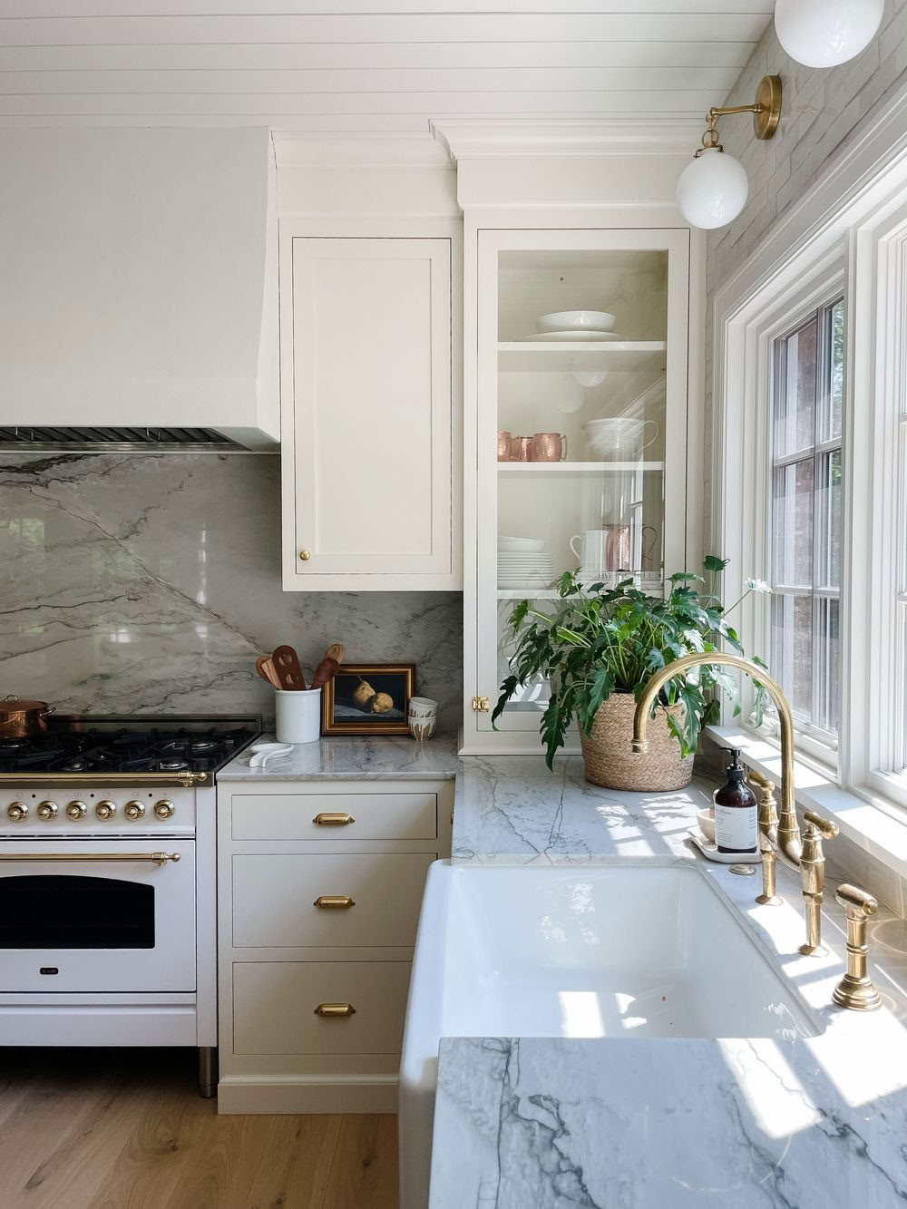
- Finishes matter — Pair with warm metals (brass, gold), natural wood, or stone counters for the most cohesive results. Many designers currently favor cream cabinets with these softer wall colors over stark white-on-white.
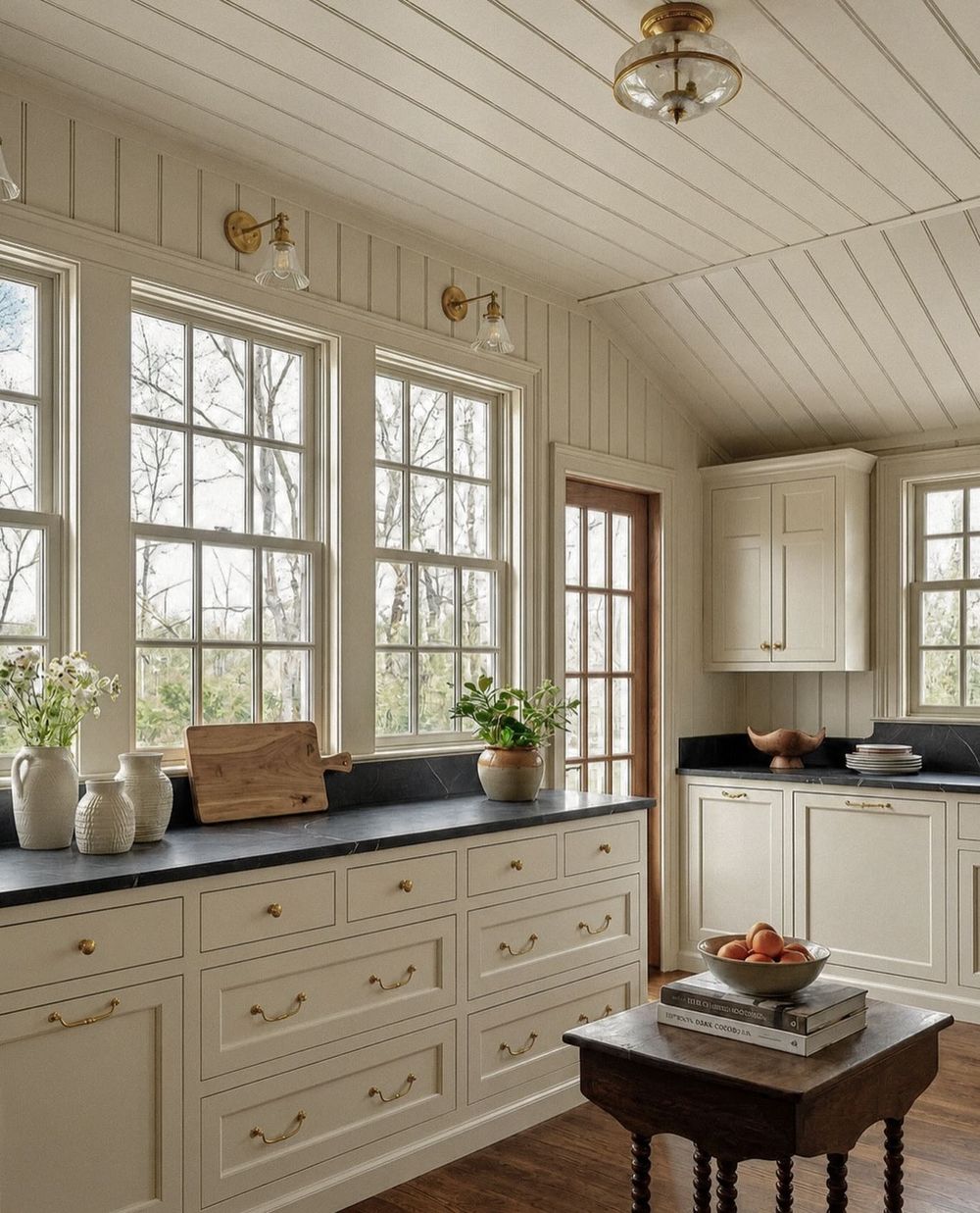
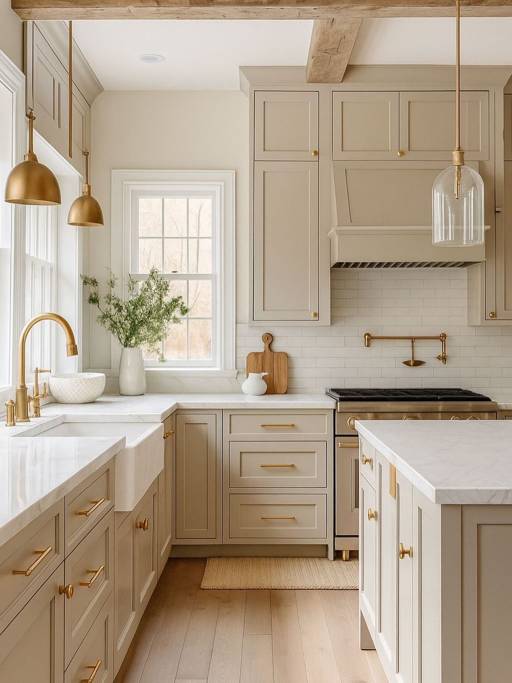
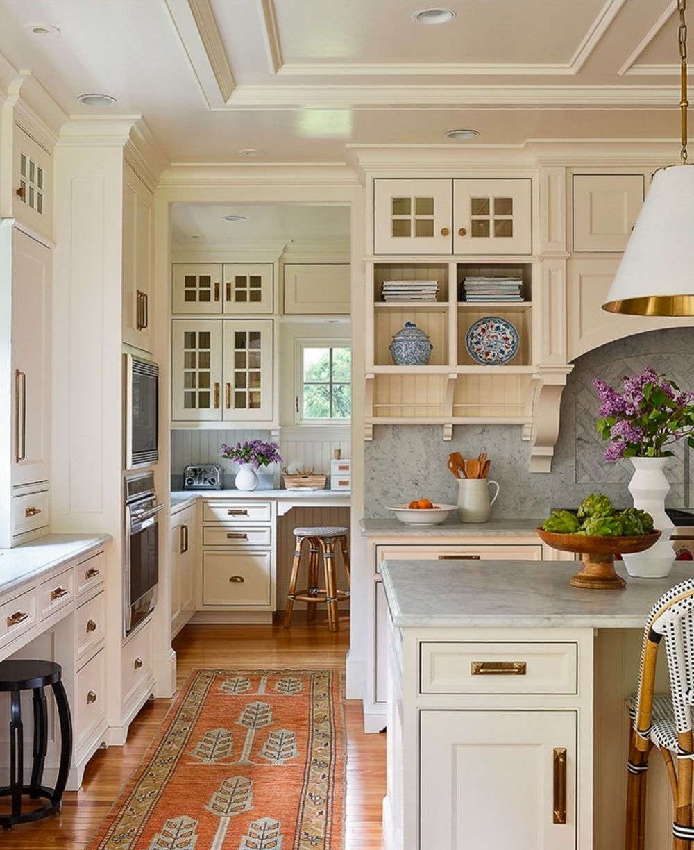
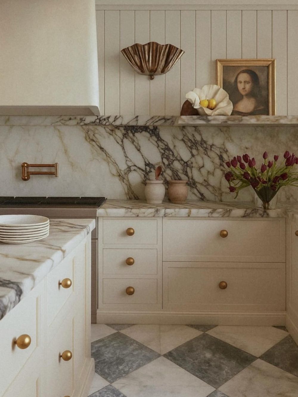
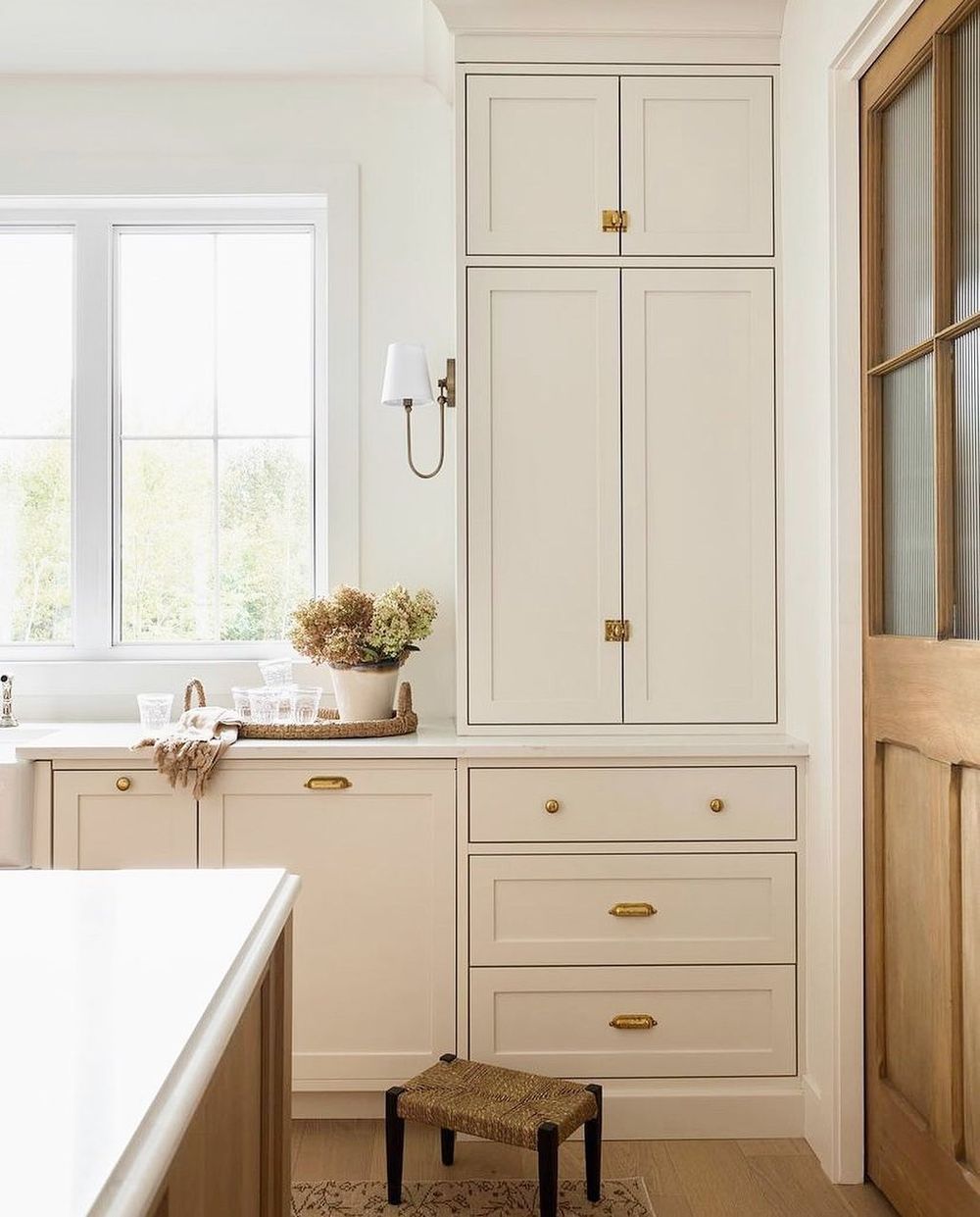
Popular specific cabinet creams themselves (if you’re choosing the cream too) include Benjamin Moore Swiss Coffee, Creamy White/Natural Cream, and Sherwin-Williams Creamy or White Duck for a more modern take.
Always sample large swatches or peel-and-stick samples on the walls before committing—paint colors shift dramatically with light and surrounding materials.